Why sketch? Why not take a photo?
Choosing what to record

Sketching, drawing, painting are about seeing in a very different way to photography. There is an art to good photography that’s about colour and lighting and composition and framing but it is about capturing what is there. Drawing and the like are about capturing what you see which I think is fundamentally different. It comes back again to ideas. What are you trying to convey in each picture. You’re not just representing the view, you’re also representing how you felt about it, what you “saw” in that view and what you wanted to say with it and about it. It can be simple or it can be quite complex.
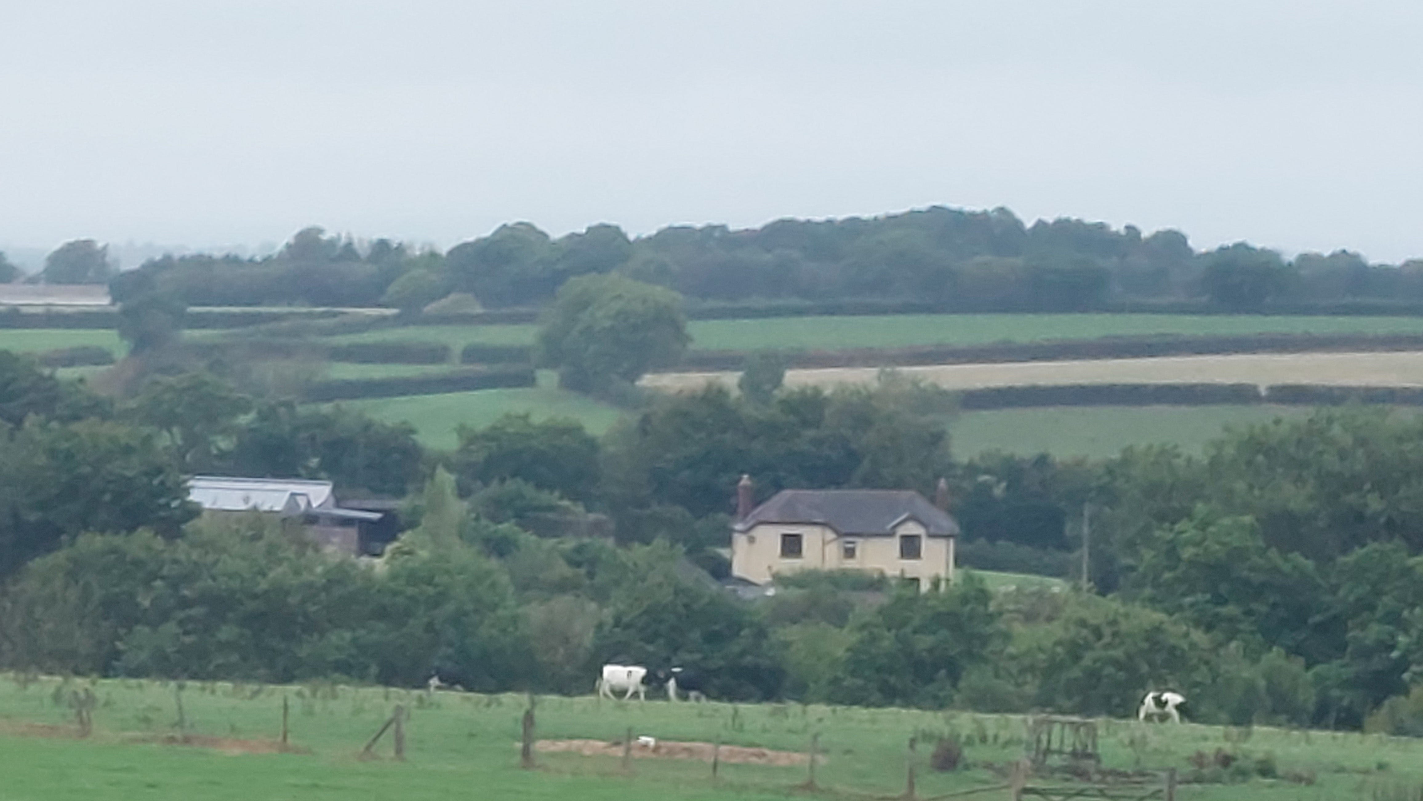
This is a photo of Charnaford farm. Now I am not a great photographer but I took time to frame the image and follow the rule of thirds in creating a composition with some interest. You’ve got a number of horizontal and near horizontal lines crossing the image with different shades of green. But everything is there, visible, in its actual physical form.
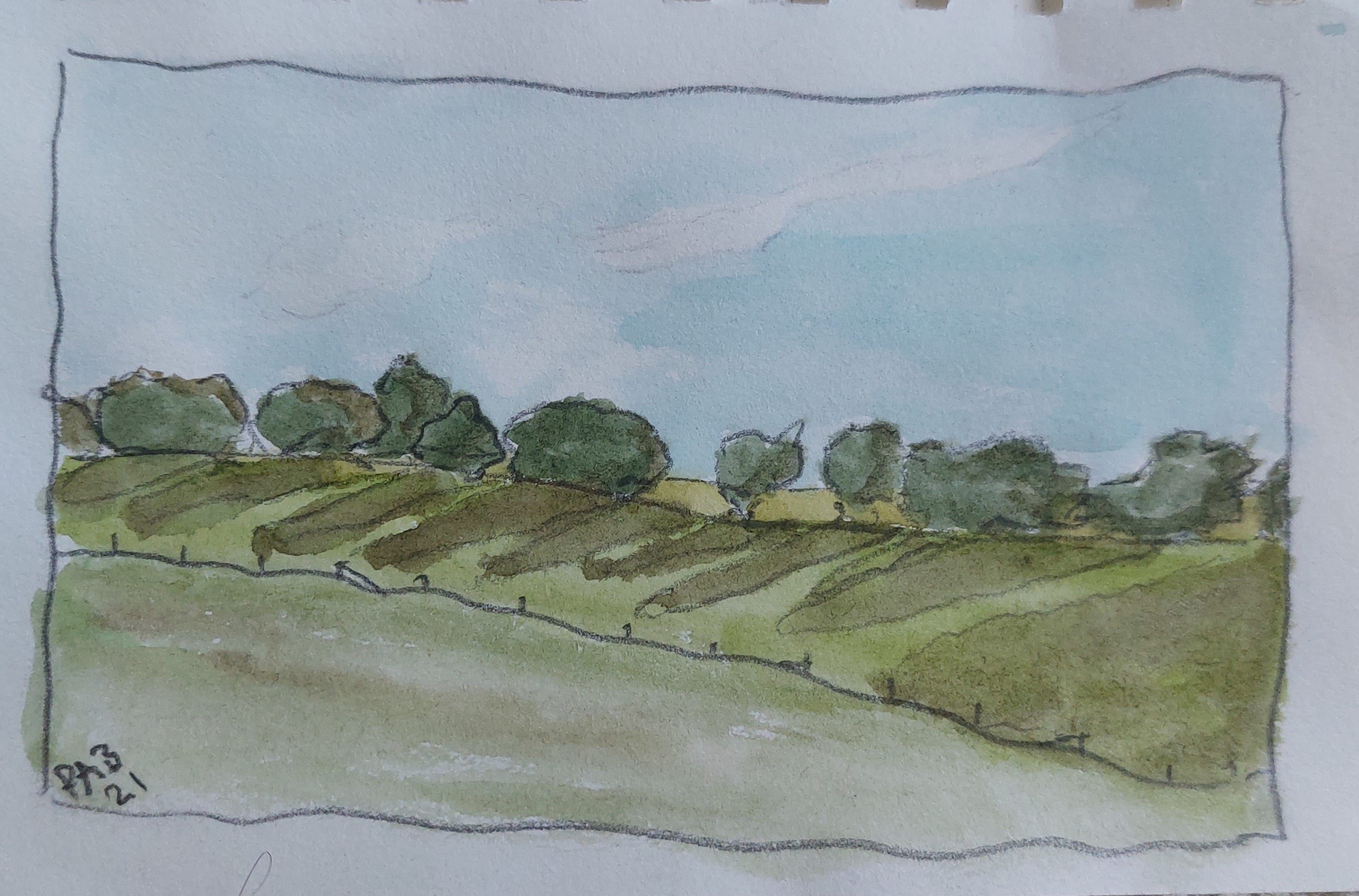
Now take a watercolour sketch of the same view.

The house is more central, the cows are gone as is the fence and the barn to the left. Moved across and into view is the large wind turbine that actually sits further to the right. The trees and bushes are now shapes as much as trees defining the lines across the frame. My focus when I looked at the view was the 150 year old farmhouse and the modern wind turbine emphasising humanity's presence in the countryside. Painting or sketching is taking down a note of the things that are important to you.
Another example.
This was a field just past the village of Upham in the Meon Valley. There’s just a row of trees on the far side of a field. Nothing spectacular but the low sun made for some wonderful long shadows which in turn made for an eye catching image. Again, because I work small for sketches, it’s about catching an impression rather than focusing on details and so you end up with blobs of colour that are trees and shadows and, hopefully, recognisable as such.
A third and final example for this time round.
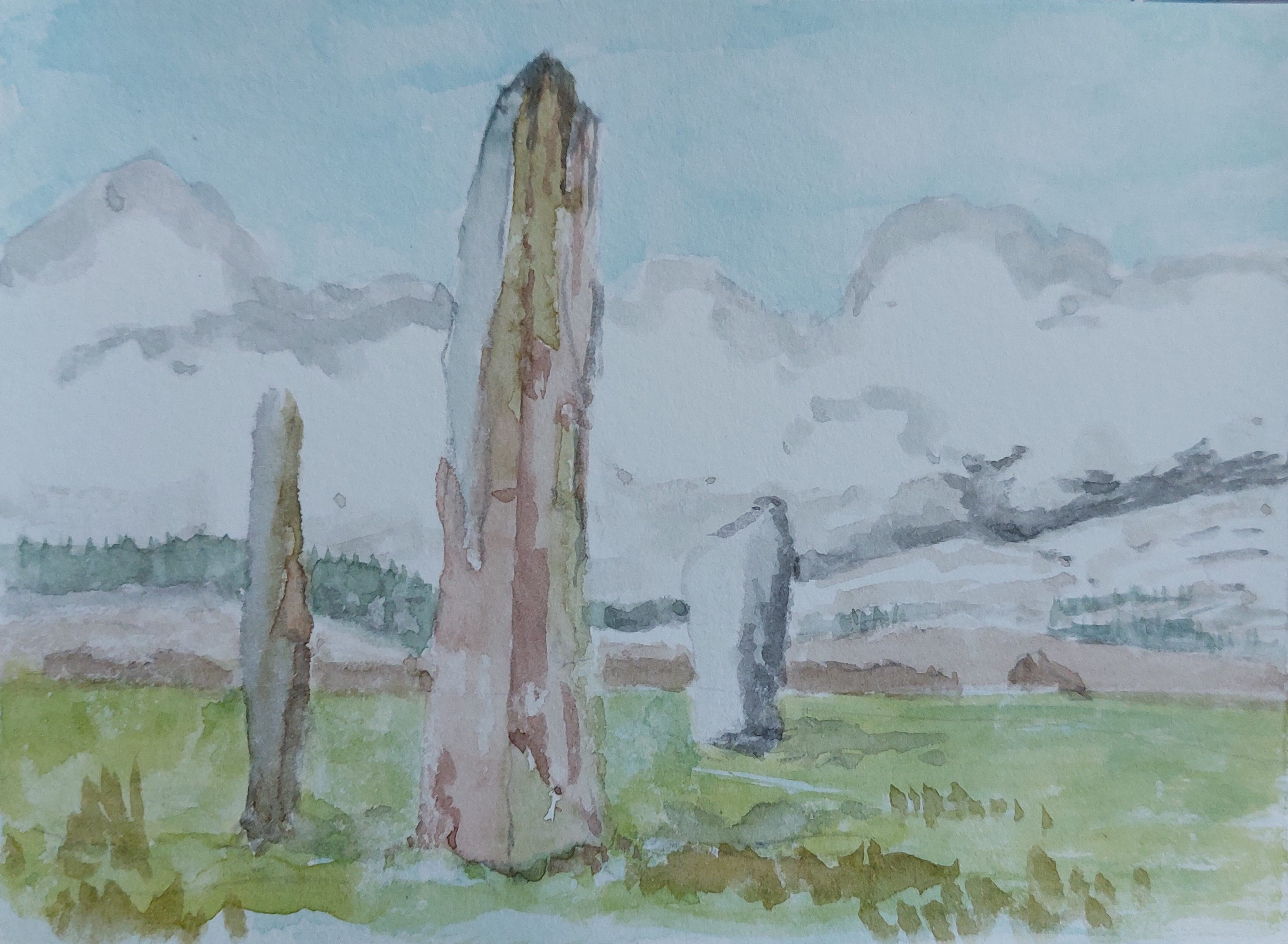
One that didn’t work for me. I had a desire to do some sketches of standing stones and, there not being many in my immediate vicinity, I decided to work from photographs. There is such wrong with this picture that I don’t know where to begin. The colour reproduction in this photo is slightly off but the sky is a completely wrong shade of blue. Itsfar too deep and looks artificial. The same is true of the greens of the grass. Only in the points where there are shadows from the stones do we get anything resembling the right colour. The three stones work okay. They are blotchy with lichen and the stone at the forefont does take on a brown shade which has worked out quite well. Then there’s the background. The cloud sitting on the hills is far to dark or needed more gradation. Instead it goes from a dark, slate line, to a large chunk of white to the palest gray. Even reversing the white and the gray would have improved things and made sense of the light.
Most artists can pick holes in their work but when it turns into a litany of errors like this you gave to accept that it's a failed picture. There is a difference between a picture that fails to meet the artists standards and one that fails to meet general standards.
Anyway. That’s enough for this week. Next week I've got a couple of days off and will be documenting a sketching outing.
Pete
Love this. A great explanation of the differences between photos and sketches. (And some fantastic sketches too!)