Funny in three pictures
Or it ain't easy being Garfield

There can be few people in the world who haven’t read Garfield or a similar newspaper strip. A good number have probably read it and thought “isn’t this supposed to be funny?” Armchair experts everywhere are blessed with 20/20 vision and a willingness to tell someone their mistakes. Garfeld is 45 this year which means there have been something over 16,000 strips. One a day every day for 45 years. That’s a geck of a demand to be funny.
So I thought i’d give it a try making one three panel funny strip. I am not sure I succeeded.
Anyway, let’s walk through it.
First thing I needed was a character or characters to star. After some thought and scribbled ideas, all of which I rejected, I landed on this.
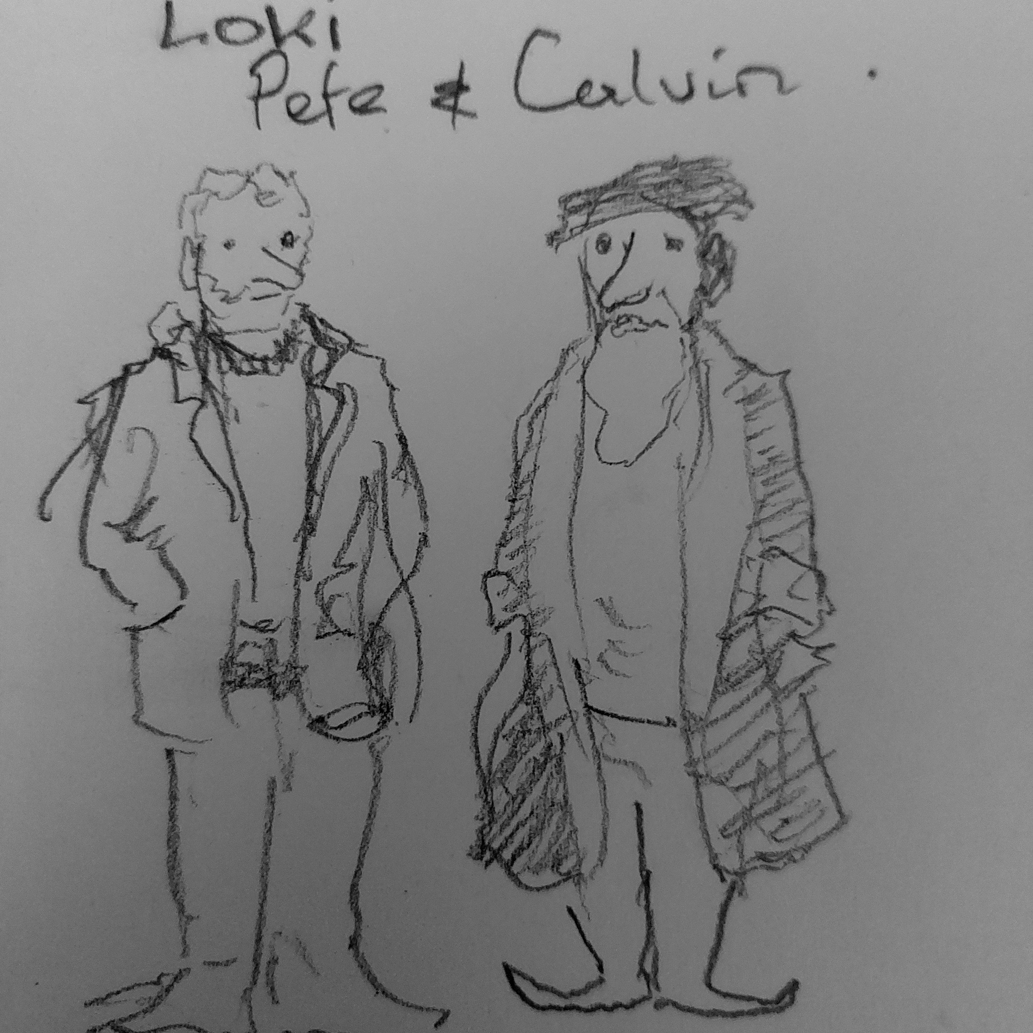
Me and John Calvin. I thought there might be some mileage in the pairing, plus it rifled nicely off of Calvin and Hobbez
Next I needed a script. There was a joke i’d heard that thought was funny but I wanted to play with Calvin a bit too. The joke punchline ended up in the second panel with Calvin's reaction as the actual punch line. I sketched in pencil where the figures would go and then laid in the text.
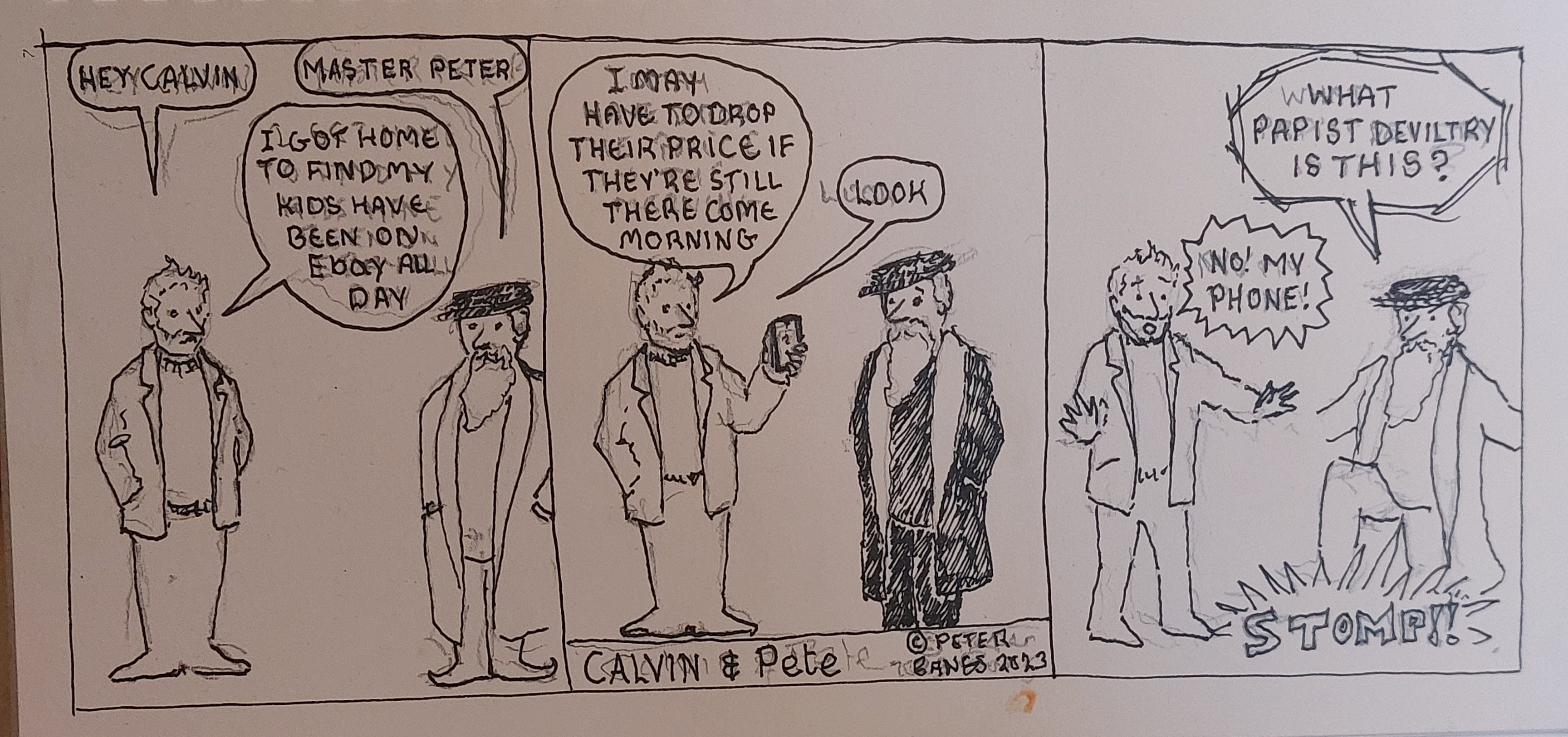
Black and white didn’t work as it lost one of the sight gags I wanted to include so out came the watercolours.
The sight gag worked better with the addition of colour. Calvin remained completely in black and white reflecting the character's worldview (big chuckles huh?)
It still needed more so I added a simple background. The background is different in each panel as a tribute to Krazy Kat, one of the artistic highs of newspaper cartooning.
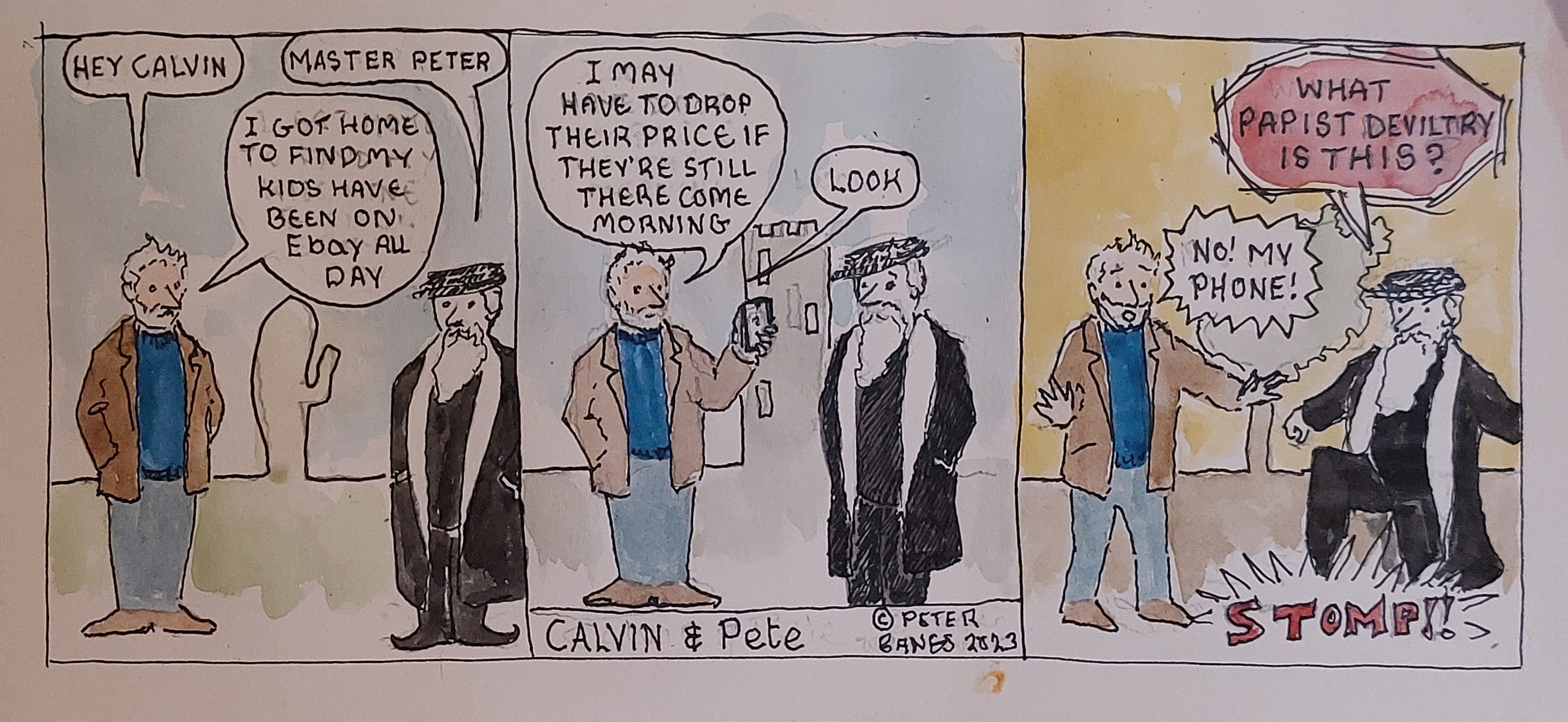
With a colour background making Calvin’s black and white more visible the strip worked apart from the fact that it wasn’t particularly funny.
Having tried my hand at it, and this was 8 hours work in total, I have a new found respect for those practices of the art of newspaper cartooning, even those I don’t find funny.
Pete
Ps. On the subject of Garfield one of the most poignant things I’ve seen is Garfield minus Garfield. All characters except Jon have been photoshopped out and the results range from funny to heartbreaking.
School was the next major stop for my pencil experience as we learnt to write with them and chew their ends. 7 years old and starting to teach myself to draw would be the next memory and learning that there were good pencils and bad pencils. Bad pencils had a waxiness to the graphite that caused a poor quality line and often broke constantly when sharpening. Good pencils sharpened easily, broke infrequently and held a decent point.
I draw largely for my mental health. Creativity keeps me balanced and not making art is usually a sign that mentally or emotionally I’m in a bad way. For that reason I’ve never been fussy about the materials I use. If it was affordable and fit for purpose that was good enough for me. To be honest, I’d draw with half a brick on the pavement or a lump of burnt wood on a wall quite happily. There is little that can match that warm, organic feel of a wooden pencil though. That sweep of carbon across paper, moving from thick to thin and back to thin lines as you move from point to side. The varying tone of line depending on how hard you press. It’s a kind of magic.
As time has passed I’ve come to appreciate a certain degree of quality in the tools I use and I’ve upgraded when the situation allowed. I always figured a pencil was a pencil though. Finding the right art materials requires a certain amount of research and trial and I discovered that there is a superstar of the pencil world, the Blackwing 602 Palamino. Where a decent quality Derwent Graphic pencil will cost you about £1.70, a Blackwing 602 Palamino will set you back around £3.50 to £4.00 a time. During a period of about 10 years when production was stopped they were selluing for around £30 each n Ebay.

There is a mystique that attaches to certain brands like Moleskine, not always deserved. The suggestion that using a particular brand will make you a better artist. Of course only practice makes you a better artist but makes of paints and pencils and brushes don’t want you to know that. Blackwing 602 Palamino pencils are like my equivalent of the red Ferrari. A midlife crisis pencil. But people I know who use them swear by them and I can’t help but feel my lovely wife would prefer me to purchase the Ferrari of pencils for £4 rather than an actual Ferrari for £145,000.
Addendum. Encouraged by my daughter I’ve just spent £16 on four top class pencils, including two different Blackwings, so I can take them for a test drive
Some of the best Scottish situation comedy comes from Calvinists - they make ideal foils for the really funny line from their non-Calvin brethren. I do not like humour mocking people - except Calvinists.
I think I have a humour block to many comic strips - Garfield being one of them - but Peanuts often seems to hit the mark - shallow huh!
On pencils, I prefer pentel 0.5mm 2B and chisel point 6B (after trying out a few brands in the shop).